


Understanding the language of branding helps you move from just designing visuals to crafting meaningful brand experiences.
This guide breaks down 10 core branding terms every creative should know—helping you work smarter, communicate better with clients, and build identities that truly connect.
1. Brand Identity
Brand identity is how a business shows up to the world. It includes the logo, brand colors, fonts, photos, and even the kind of words the brand uses. All these things work together to give people a certain feeling when they see or hear about the brand. A strong identity makes a brand easy to spot and remember.
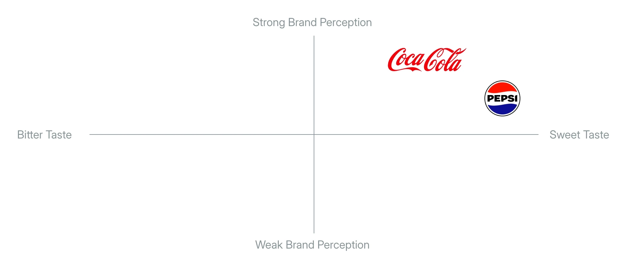
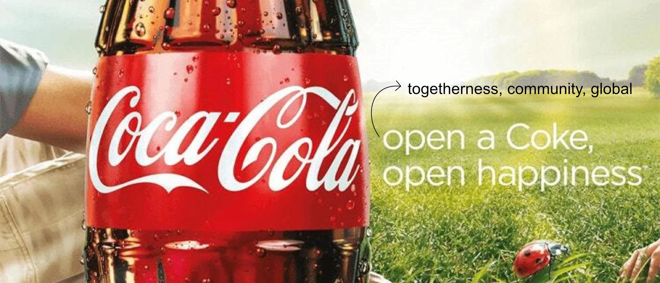
2. Brand Positioning
Brand positioning is about where your brand stands in people’s minds compared to others. It explains who the brand is for, what makes it special, and why customers should choose it. Clear positioning helps a brand connect with the right audience and stand out in a crowded market.
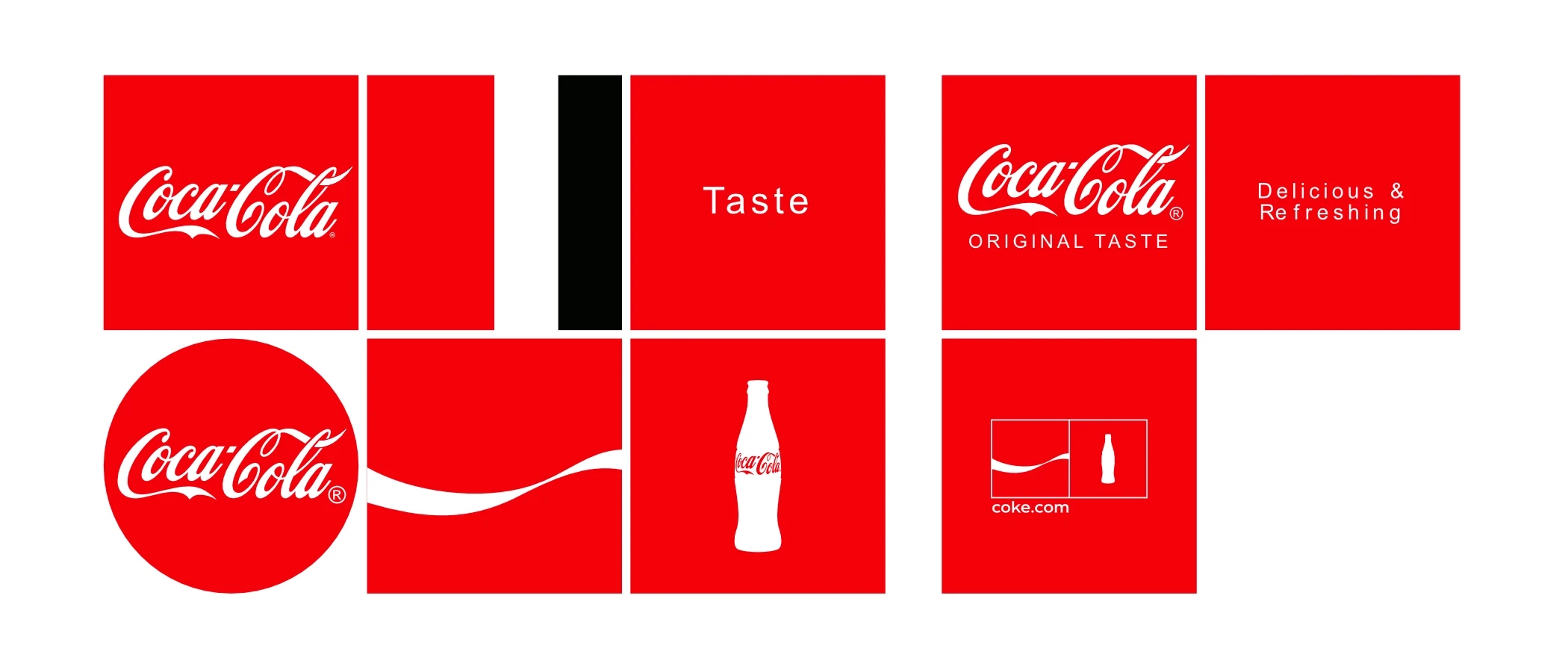
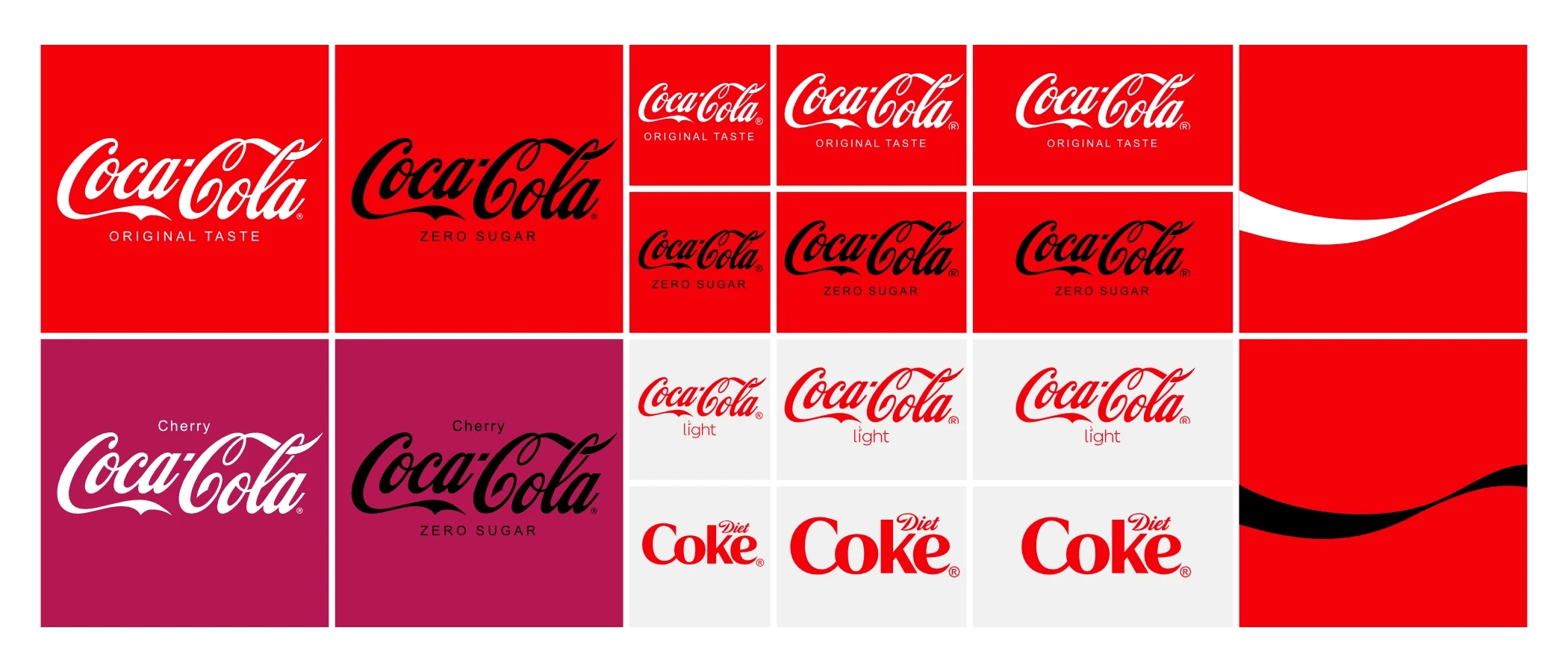
3. Visual Identity System
A visual identity system is the full toolkit of visuals a brand uses everywhere from websites to packaging. It includes logo variations, colors, fonts, icons, layouts, and design rules. This system helps make sure the brand looks the same no matter where people see it.
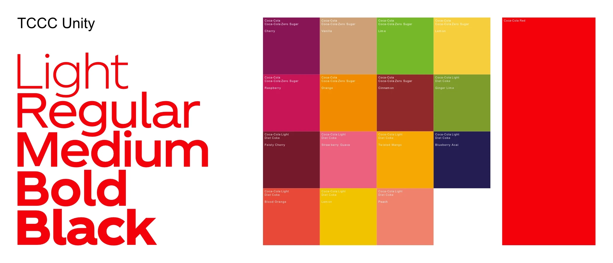
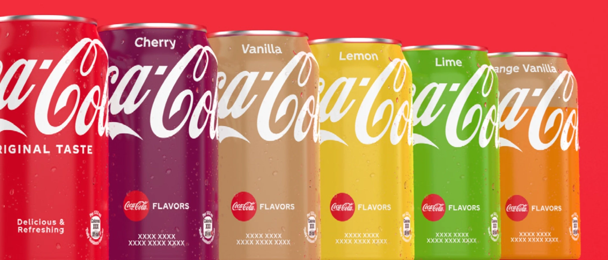
4. Brand Guidelines
Brand guidelines are like a manual for using a brand correctly. They explain how to use the logo, what fonts and colors to use, how to write messages, and more. These rules help everyone stay consistent no matter who’s working on the brand.
5. Brand Architecture
Brand architecture shows how a company’s different brands, products, or services are organized. Some companies have one brand name for everything. Others have many brands under one umbrella. This setup helps people understand how all the pieces fit together and makes future growth easier.
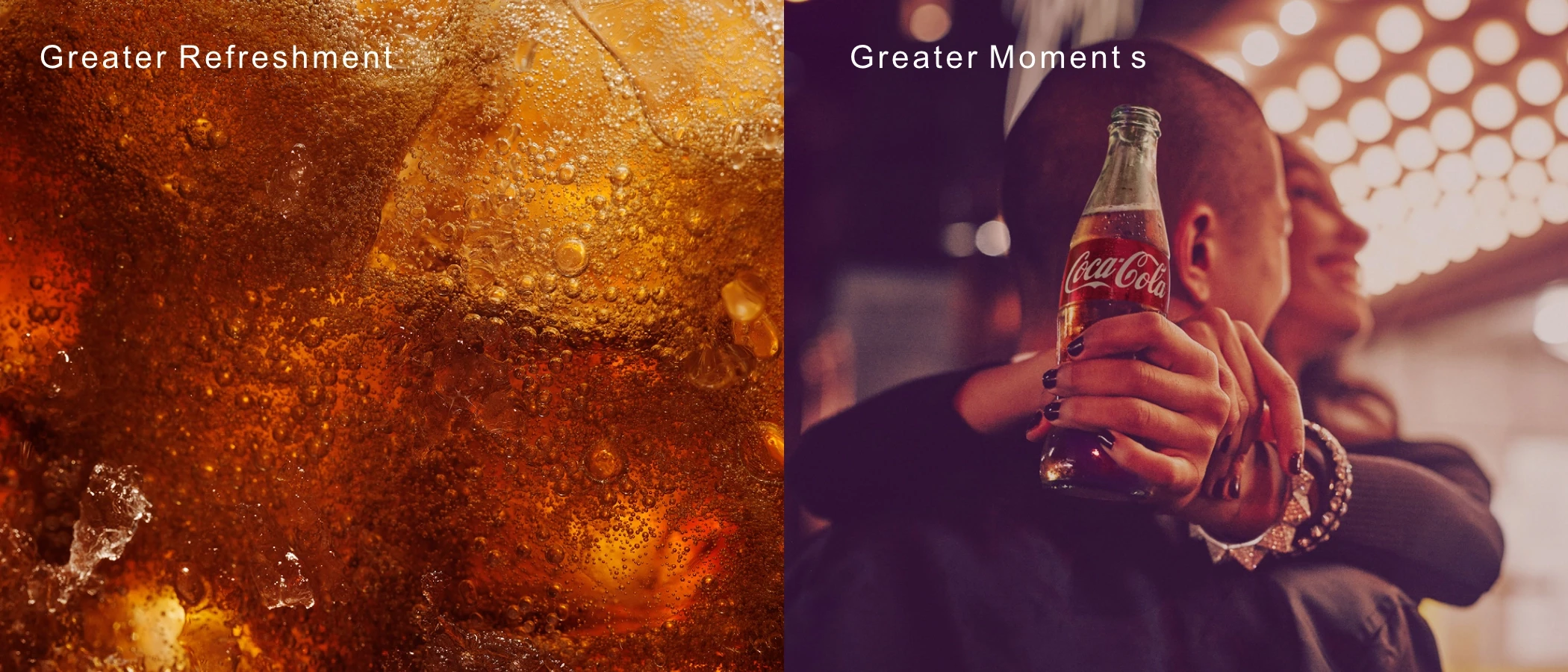
6. Tone of Voice
Tone of voice is how a brand sounds in writing. Is it friendly? Professional? Bold? Calm? The tone shows the brand’s personality and helps people feel more connected to it. Using the same tone everywhere builds trust and makes the brand feel real.
7. Brand Equity
Brand equity is the value a brand builds over time. It comes from how much people trust, remember, and prefer the brand. Brands with high equity are more recognizable and can charge more. Good design and a great experience help grow this value faster.
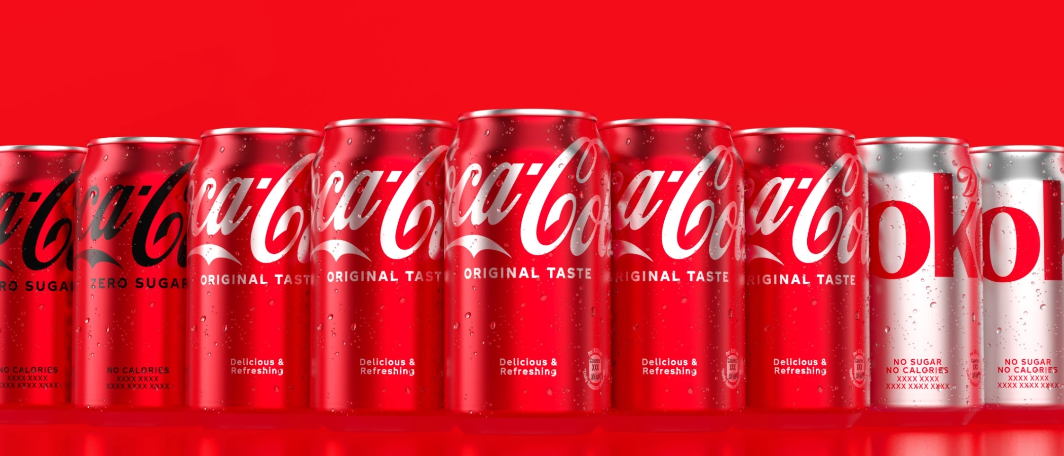
8. Brand Touchpoints
Touchpoints are all the places people come into contact with a brand like websites, packaging, ads, social media, or emails. Each one is a chance to make a good impression. Keeping touchpoints consistent makes the whole experience feel smooth and professional.
9. Logo Lockup
A logo lockup is a set layout of the brand’s logo, icon, and tagline. It is used to make sure the logo looks neat and clear no matter where it appears. Having lockups ready saves time and avoids messy design errors.
10. Brand Consistency
Brand consistency means showing up the same way across all platforms. Same look, same tone, same message. When a brand is consistent, people start to recognize and trust it. Even simple things like using the same colors or tone of voice help build a stronger brand.
Final Thoughts
If you want to be more than a good designer, if you want to build real brands, then mastering these terms is a must. They’ll help you create with purpose, speak with confidence, and design with strategy.


